
A few things have changed in the living room since we moved in. The first thing that I tackled was changing the wall color. The beige on top is the original color, which I have been considering changing for a long time but still haven't made the move. The bottom color, below the chair rail, used to be forest green. Gross! I wanted something bold and crazy so I went with this aqua color from Behr, called WipeOut. It looks a little muted in the picture, but I called it "Malibu Barbie Beach House Blue".
The other thing we changed were the floors. They were carpeted before, but after much begging on my part, we decided to go with wood laminate. The laminate is GREAT and so much easier to clean, especially with pets. Plus, I really like the wide slats we chose. The natural texture makes it seem more "real" than other laminates we saw.
That black boxy looking thing is our fireplace, but it didn't really show up in the picture. We never use it though, because it makes our smoke detectors go off every time. Now that I'm looking at it, I'm thinking about painting the edges white and maybe putting some pillar candles in there.
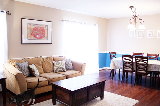
This shows the dining room side of our living area. I dream about the day when we can have a separate dining room! It works for now though. That is also the patio door that goes out onto the deck. We face the woods and it's lovely. I also refinished that coffe table/chest. It was a beast to refinish but well worth it.
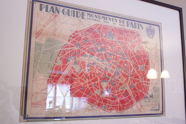
I bought this vintage reproduction of a tourist map of Paris when I was visiting my sister in Philadelphia. It's called Hello Home and it might be my favorite store in the world.
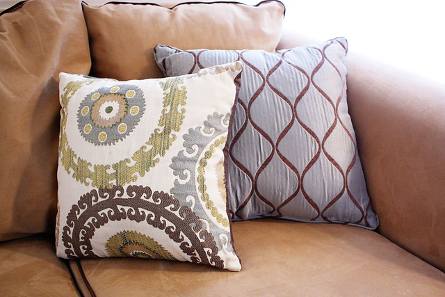
These are our throw pillows, which I bought on Friday. I have a PROBLEM with throw pillows. I have been searching for the perfect ones for literally years. A while back, I stenciled and sewed my own pillow cases (you can read the post here) and I loved them. The only problem was that the fabric I chose was kind of strange, and ended up being a magnet for pet hair. When people came over to the house, I would spend 45 minutes just trying to dig the pet hairs out which seemed to become woven into the fabric. So I threw in the towel and decided just to buy these ones, from GardenRidge. I love the patterns, but I could deal with less muted colors. Oh well.
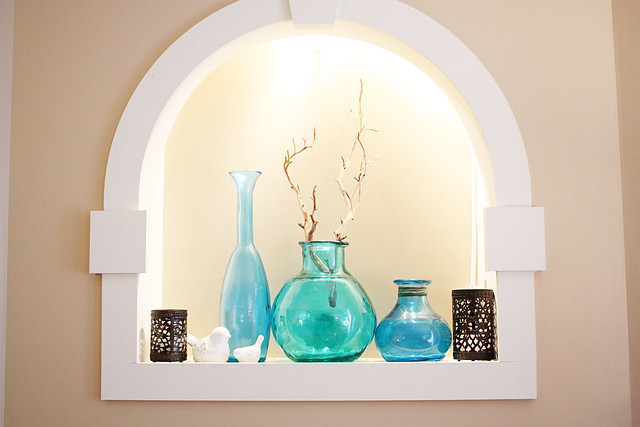
Here is a better view of the display nook above our fireplace. I love this little area! I think everything in here except for the bronze stencil candle holders are from TJMaxx or Marshalls.
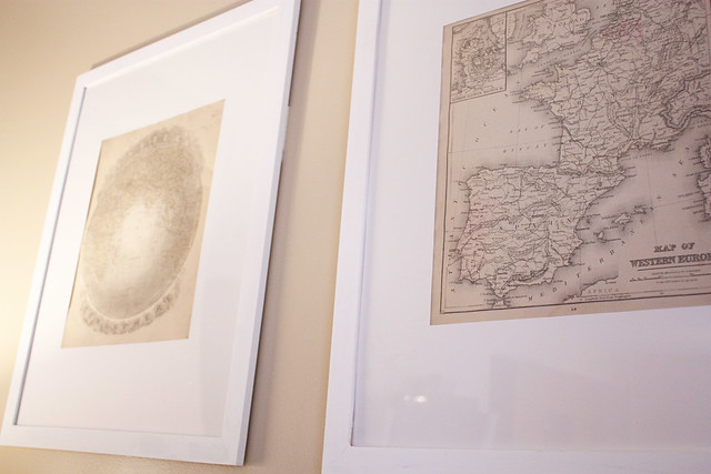
These are the framed prints that are above the loveseat. They are pages from a vintage atlas that I bought at an estate sale, for like, $1. I cut mats out of some bristol board and mounted them in these cheapo Ikea frames.
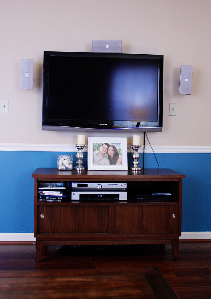

This is the view straight across from the couch. Our lovely tv (which came with the house because the old owners didn't feel like repairing the wall behind it where it was mounted, score!) Also, is it weird to have a framed picture of yourself displayed? Don't answer that, ha. I've been meaning to put a wedding picture in there but haven't had them printed yet. Yes, from our wedding, which was nearly three years ago. Don't judge. The tv stand is from Target, where I found it on clearance for $70. The mercury glass candle holders are also from Target. To the left is a glass vase filled with seashells and coral from our honeymoon.

I love these candle holders.
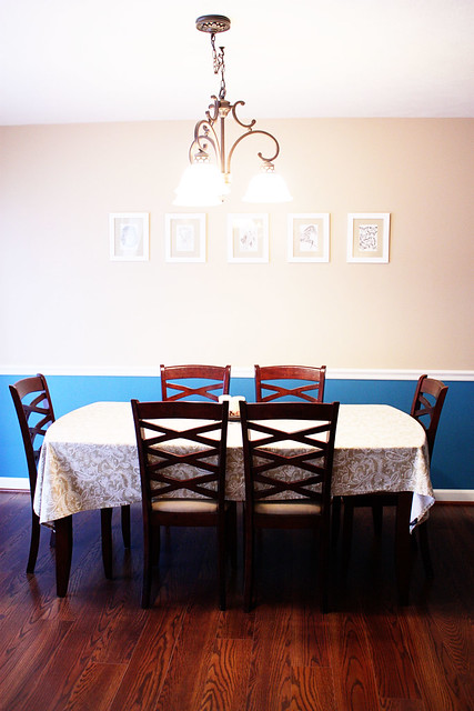
Well .. . . looks like I forgot to straighten the table cloth. Hoping to replace that ugly light fixture with this for my birthday (hint, hint Frank).
Stay tuned for the next installment of the house tour. Do you have a house tour on your blog? Leave a link! I LOVE looking at people's houses.


Your place is so adorable and neat!!! :) I have too much stuff. :/
ReplyDeleteThanks! It definitely does not look like this all the time though, most of the time its covered in junk ha
ReplyDeleteLOVE this! I love house tours. Your living room is so beautiful, I am jealous! I'm still a renter so I can't do what I want to yet. LOVE the pop of blue and I think painting the fireplace white and putting tall pillar candles in it would look fantastic!
ReplyDeleteI think I might feature this the next time I blog about interior design :) I'll send you a link when I do!
Thanks, that would be awesome! Checking out your blog now :)
ReplyDeleteI really love the colors inside your house. I wonder how did you do that, designing your place without spending too much money. I hope I could do that like yours.
ReplyDelete