So anyway, I decided I was tired of the two toned look of our living room, and wanted to lighten it up so it's nice and bright for the winter (hello, SAD sufferer). But once I had the room painted a very pale aqua, it was suddenly way too cool and bland looking. Enter Crate and Barrel and some cheap DIY tricks to add some warm orange accents.
So here is the living room before:

And here is the after:
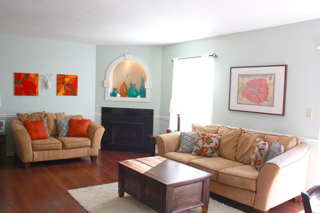
I did really love that bold teal color but it was a little TOO bold to put all over the room, and I was just over the two toned look. I am also not a fan of beige, and I think it casted a yellow tone on the room. So here's the rundown of the changes:


I kept the light blue trellis-patterned pillows (um yeah, just realized one is sideways. I'm not a photographer and I'm not an interior designer) but replaced the other ones with these bad boys from Crate and Barrel. They're just much better quality pillows and I like the more graphic and colorful look. Kept the framed vintage map of Paris above the couch. (PS - I want a sectional, BAD)
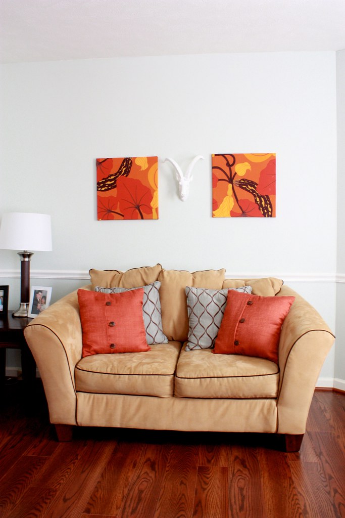
The color is totally off in this photo and doesn't really do this side of the room justice, I swear. We grabbed those rust orange pillows from JCPenney, which have the same burlap feel as the Crate and Barrel ones. And I love the buttons. See the wall art? I bought two cloth napkins from C&B that were on clearance for $8. Then I bought two square canvases from Hobby Lobby and stretched them on it, using a staple gun on the back.
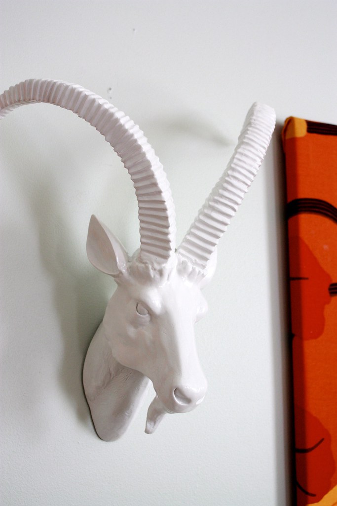
I'm kind of in love with this antelope/gazelle/goat? head from Home Goods. Frank looked at me like when I was completely insane when I plucked it off the shelf and said, "I'm getting this, now," without any consideration. I think he kind of loves it now :) Plus I knew it would look awesome because I saw it's distant cousin here. I share the white ceramic animal obsession, it's a sickness

The lighted nook above the fireplace didn't change much, I just cleared some clutter and added this orange vase that I found at Marshalls.

Here's the surprise! I did paint this wall the light aqua color to begin with, but it felt like one big long blue room. So I decided to use some leftover brown paint to do an accent wall, in order to kind of separate the dining area from the living room area. I LOVE it! This photo really is horrible though, I suck at Photoshop. The paint is definitely warmer and slightly darker and really contrasts with the white chair rail.

The artwork is the same stuff that used to be above the the loveseat. They are pages from an old atlas that I bought at an estate sale. The matting on it was white before, so to make it pop a little more, I grabbed some fabric that I already had and just wrapped the mats.

And here's a picture of Little Man sleeping on the dining room table, because he has no manners.
I love the wall color and the pops of color! Great update!
ReplyDelete